9 Data Dissemination: Part 2
For part 2, we focus on the importance of your target audience, different types of dissemination, and data visualization.
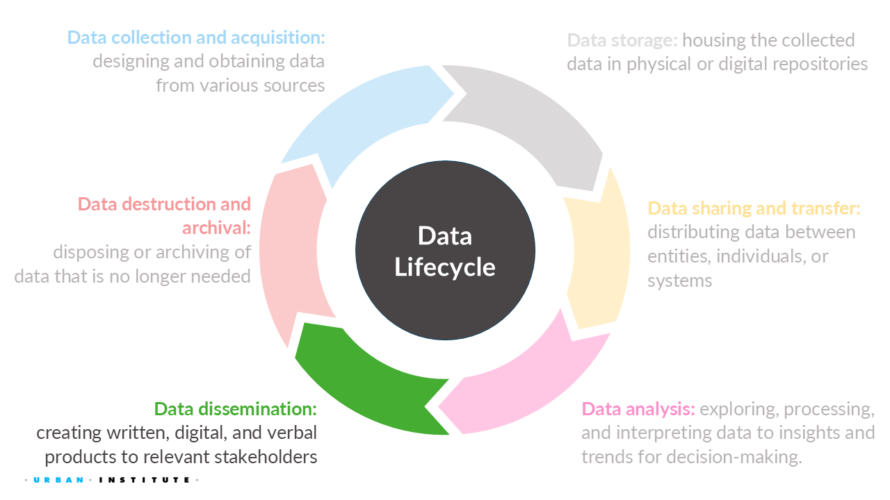
9.1 Types of dissemination
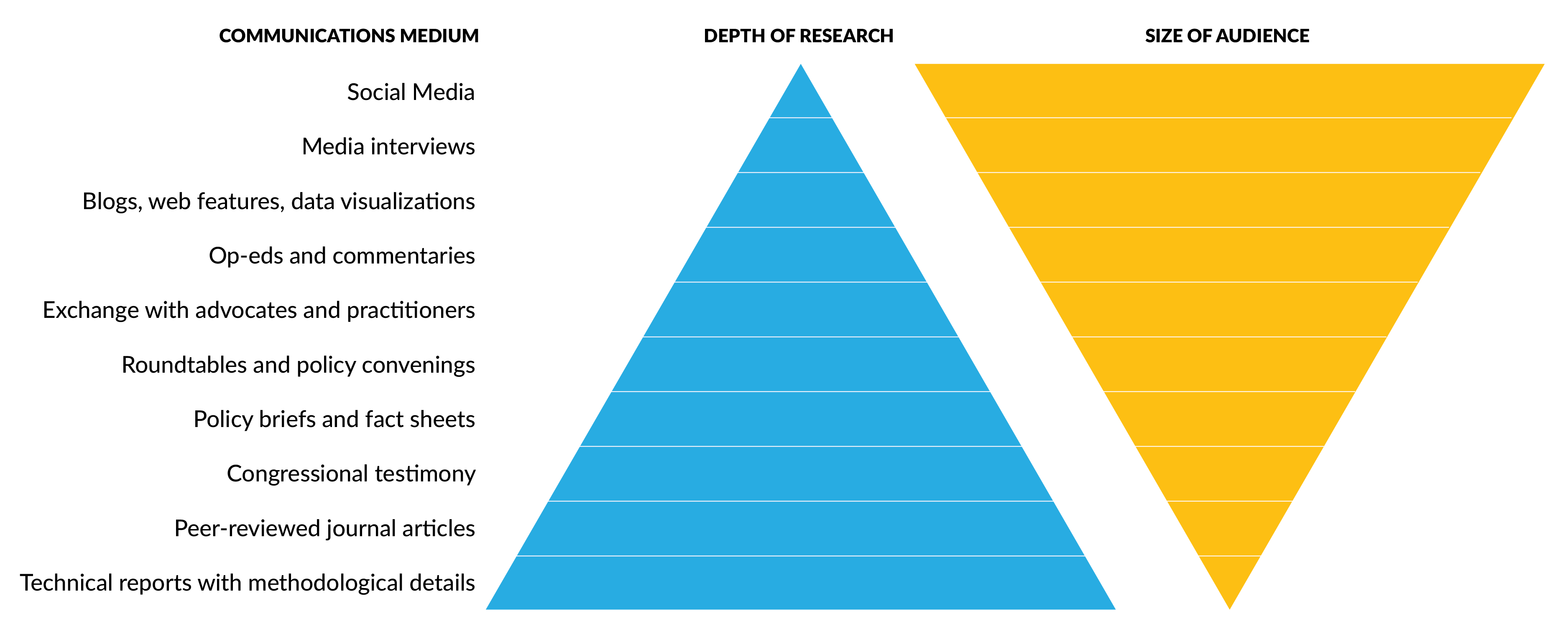
Every product on the Complexity pyramid links to one below it, grounded in in-deph, sophisticated analysis. Every blog post links to underlying evidence and a report. Every web feature includes the option to download a dataset or report. Every tweet finds its way back to a more in-depth analysis that provides evidence to support the claim made at each level of the pyramid. The data are available for the user who wants to dig deeper. Evidence is a as deep – or deeper – than the question planted, and then answered in detail.
To help create an audience list, check out this “Audience & List Brainstorming” worksheet.
- Identify your audience. The most effective outreach campaigns are deliberate about who they are trying to reach and how they will reach them.
- Narrow your focus. Trying to reach everyone often results in reaching no one. It’s better to find a smaller group of people who are keenly interested in your work than a wider group that may gloss over it.
- Play the long game. Building a relationship with your audience happens over time. Take the time to understand where your audience members are in their engagement and influence, and build from there.
- Meet your audience where they are. Build your trust and credibility by finding what is relevant to them and giving them the level of detail (or lack of detail) they need.
9.1.1 Infographics
Infographics can be effective as a data dissemination product by:
- Using colors, graphics, and creative designs to make the content more engaging compared to plain text.
- Distilling complex information into digestible visuals, making it easier to understand and remember.
- Enhancing retention of the information, which results in quickly communicating the necessary information.
- Sharing the material is much easier for on social media and other digital platforms, such as blogs and websites.
9.1.2 Blogs
A blog is more accessible to convey content to a wider audience than a long report. But, making a good blog is difficult!
When coming up with a concept, consider:
- Sharing your unique perspective. What are you offering to the topic that no one else can?
- Surprise your readers. what would make people be surprised to learn about the topic? What surprised you about the topic?
- Highlight next steps. What would you want to explore further on the topic? Remember from our communication session? Always have a follow-up!
- Identify a hook. What are you highlighting that sheds light on the topic?
When writing a blog, it should be:
- accessible and straightforward
- captivating from the first sentence
- focused on highlighting the main point early (to avoid losing your audience)
- free of jargon
- organized with bullets, multimedia, numbered lists, etc., to break up content
- linked to other resources for deeper dives into the content
- roughly 400 to 800 words in length
- composed of short paragraphs—four lines or fewer
Finally, the title and subtitles should be appealing, searchable, concise, and free of clichés.
- Blogging expands your audience – and your impact. Blogging can be an effective way to get your research out into the world and into the hands of people who can turn your findings into action.
- Keep your posts short and snappy. Remember, one points per post – more than one point means more than onepost – and try to make it a quick read. Use links and multimedia as shortcuts.
- Get the word out. Use other communications tools at your disposal to drive readers to your posts.
- Keep trying. Learn from your missteps and celebrate your successes.
9.1.3 Briefs and fact sheets
A fact sheet is a short document that contains the most relevant information about a specific subject. A fact sheet should be about a page or two in length with the goal to quickly and efficiently communicate the key facts and points in a clear, concise, and easy-to-understand manner.
9.1.4 Technical reports
Technical reports is a longer document that provide the full details of the process, results, and other information from a scientific study or research.
9.2 Allegheny County social and human service utilization data
The Urban Institute collaborated with the Allegheny County Department of Human Services and the Western Pennsylvania Regional Data Center (WPRDC) to create a synthetic version of the County’s confidential social and human service utilization data. Synthetic data replace actual records in a dataset with pseudo-records, with the goal of closely mimicking key distributional and statistical properties of the original records. This allows agencies to release data disaggregated by race and ethnicity while reducing the risk of privacy violations. Graduate students at the University of Pittsburgh examined the data and confirmed that it could be used effectively, for instance, to allocate resources for overdose prevention. WPRDC and other stakeholders plan to use the synthetic data to better understand and address racial disparities in the county, track changing patterns of service delivery, and develop more cost effective strategies for helping individuals who use multiple county services.
This pilot project produced a suite of resources we are using to support similar efforts across the country.
9.2.1 Training materials
This training series is provided in partnership with Allegheny County and the Western Pennsylvania Regional Data Center (WPRDC). While synthetic data has been used at the federal level, local governments and organizations often do not have the human or computational resources required to implement synthetic data as a privacy-preserving technique. As part of a pilot program intended to understand and target the specific privacy-related needs of local governments, the Urban Institute is offering these trainings to any local stakeholders wishing to learn more about creation, applications, and limitations of synthetic data.
9.2.2 User guide and infographic
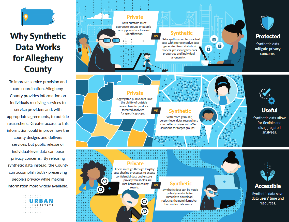
This user guide and infographic accompanies a fully synthetic version of the 2021 Integrated Services dataset, which replaces the underlying records tracking the use of these services with statistically representative pseudo-records. Each record in the synthetic dataset represents a simulated individual, or record, who received at least one service from the Allegheny County DHS in 2021. The synthetic data were designed such that records aggregated by service represent the original data.
9.2.3 Blog and technical material
“How Local Governments Can Harness Disaggregated Data without Compromising Privacy”, Urban Wire blog, meant for a broader audience.
“Communicating Synthetic Data Evaluation Results with a Parameterized R Markdown Report”, Data@Urban blog (more technical).
9.2.4 Fact sheet
Researchers, service providers, and other stakeholders can benefit from access to individual-level data safeguarded by governments or organizations. However, the public release of granular (disaggregated) data can violate the privacy of the people represented in that data. An alternative is to use synthetic data, which replace actual records in a confidential dataset with statistically representative pseudo-records, enabling data curators to release data that would otherwise be too sensitive for public release. This fact sheet provides an overview of use cases for synthetic data and the broad process for creating synthetic datasets, including definitions of applicable terminology. It also discusses how to evaluate the quality and privacy of synthetic output.
9.2.5 Technical report
This technical brief details the methodology used and technical decisions my colleagues made when creating and evaluating the synthetic service data, including:
- background on data privacy importance and key definitions,
- limitations of current Allegheny County Human Services data products and use cases for synthetic data,
- key features of the service data and the resulting impact on our methodology,
- preprocessing the service data to serve as a valid input for the synthetic data generation process,
- modeling and synthesizing service usage and service distributions over time,
- postprocessing the synthetic output to match the desired use case, and
- evaluating candidate synthetic datasets for quality and privacy.
9.3 Data visualizations
Similar to outlining a presentation, don’t race to the computer. Start with paper and pen (or color pencils/markers!), chalkboard and chalk, etc. to sketch out your data visualization.
- Always consider your audience. Visualizations for an academic journal article will be very different than those you show to a policymaker or a reporter.
- Drive your reader’s attention where you want it by carefully and purposefully using colors, lines, markings, and other visuals elements.
- Make your charts active through good, concise titles, and useful annotations.
- Don’t get bogged down by the same old graphs time and time again; lots of different graph types out there might help reveal interesting patterns or insights in your data.
9.3.1 Show the data
Your reader can only grasp your point, argument, or story if they see the data. This doesn’t mean that all the data must be shown, but it does mean that you should highlight the values that are important to your argument (J. Schwabish 2021).
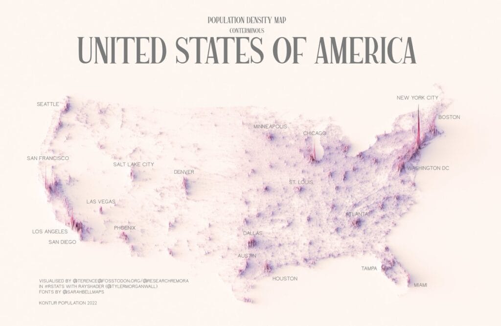
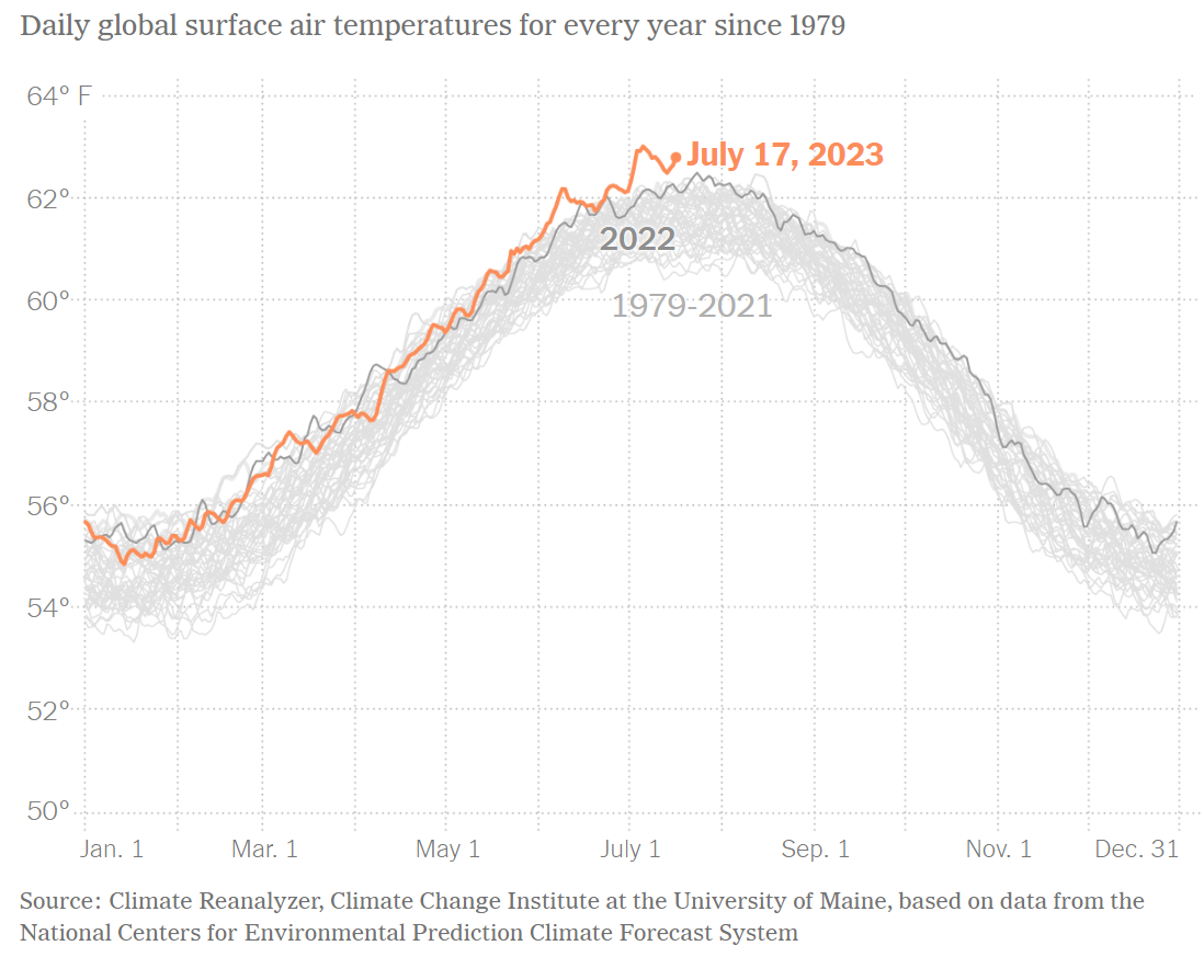
This density map of the United States demonstrates how all the data are shown without extra information (e.g., state lines, streets, rivers, etc.) because the point being made is that most people live along the boarder and coast.
9.3.2 Reduce the clutter
Although it may seem obvious, sometimes it needs to be said: avoid any unnecessary visual elements that may distract the audience. Some examples include:
- Tick marks and grid lines are usually not necessary.
- Using different shapes (e.g., circles, triangles, and squares) helps distinguish points, but if they overlap too much, you can’t tell the difference. Consider another type of data visualization.
- Solid shades of color work just as well (and usually better) than textured or filled gradients.
- Avoid 3D unless it actually adds something meaningful.
- Remove extra text or labels as much as possible.
9.3.3 Integrate the graphics and text
The text included in a graphic is just as important, if not more so, than the data within the visualization. Text or annotations in data visualizations help direct your audience to the key parts of your visual. J. Schwabish (2021) recommends the following three tips to effectively integrate text into data visualizations:
- Removing legends: Having your audience try to connect information in the legend to the data visualization places the burden on them. It is better to directly add text to the data itself, such as labeling a line.
- Creating active titles: Crafting your titles like newspaper headlines will help your audience grasp the takeaway immediately, rather than trying to figure it out on their own.
- Adding detail: Once you create the data visualization and decide on a title, ask yourself, “Would this visual benefit from more text?” Only add more text if it adds to the audience’s understanding of the graphic. A classic example is including important events on a line graph to help explain changes.
9.3.4 Avoid speghetti chart
Some data visualizations have too much information. Avoid this by breaking up the information into multiple charts. However, be careful not to create too many. They should share the same layout, size, font, and color so the audience doesn’t have to “rethink” what they’re seeing.
9.3.5 Start with gray
Finally, start with gray, no matter what visualization you are creating. This will force you to be purposeful and strategic in your use of color, labels, and other elements.
9.3.6 Examples
What’s Going on in This Graph? - “Graphs, maps and charts from The Times — and an invitation to students to discuss them live.” This feature is also in partnership with the American Statistical Association to help educate grades 7 - 12+ students in math, science, English, and social studies answer the following questions:
- What do you notice?
- What do you wonder?
- What impact does this have on you and your community?
- What is a catchy headline that captures “what’s going on this graph”?
PolicyViz Data Visualization Catalog - From my colleague, Jon Schwabish, who “… built a collection of nearly 2,000 visuals to use as inspiration for [his] own work, and also to use as teaching materials to illustrate both good and bad practices. These real examples are helpful in a variety of ways: to demonstrate the wide variety of graphic types; to show variations in typography, color, tool, platform, and design; and to discuss how to implement perceptual rules to draw and direct attention.”
Data Visualisation Catalogue - A project developed by Severino Ribecca to create a (non-code-based) library of different information visualisation types. The website serves as a learning and inspiration resource for those working with data visualisation.
Data Is Beautiful: 10 Of The Best Data Visualization Examples From History & Today - an article on Tableau that goes over what is data visualization and 10 great examples.
Data is Beautiful - a subreddit on Reddit that tends to have cool and fun data visualizations.
9.4 Recommendations when publishing information based on confidential data
9.4.1 Report only necessary information
In other words, do not share additional information, such as dates and locations, if it doesn’t contribute to the dissemination product.
9.4.2 Avoid reporting inclusion and exclusion criteria for subpopulation analyses
Don’t discuss these criteria in a way that inadvertently identifies small cells or extreme cases (e.g., suppressed values with less than three that occurred in a census block).
9.4.3 If possible, have participants review the products
If the dissemination product contains potentially identifiable information, such as direct quotes, the involved participant should be consulted before the product is released. Even if prior consent was given for the use of direct quotes, project team members should reach out to the individual to confirm permission for publication and attribution of the quote.
9.4.4 Follow Transparency Initiative requirements
The American Association for Public Opinion Research Transparency Initiative provides a list of elements that must be disclosed with all publicly and/or proprietary research products. Most dissemination products should cover these basic requirements.
9.5 Week 6 Assignment
Due August 3rd, 11:59 pm EDT
9.5.1 Read
- Chapter 7: What Is the Future of Data Privacy?
9.5.2 Optional additional read
9.5.3 Write (600 to 1200 words)
Throughout this course, we’ve explored the intersections of data privacy, security, and ethics. Drawing on the topic you picked for your presentation (or can be an example from course readings and discussions so far), respond to the following prompts:
- What data did the AI system, algorithm, or example you selected use to shape what was shown to you (e.g., content, recommendations, decisions)?
- Does this scenario apply broadly to the general population, or primarily to a specific subgroup? Explain your reasoning.
- Could the example you discussed be repurposed or modified to serve a public good? If so, what changes would be necessary?
- Would those changes raise new considerations around security, privacy, or ethics? If yes, describe them.
9.6 Week 6 Assignment (ALTERNATIVE!)
Due August 3rd, 11:59 pm EDT
9.6.1 Read
- Chapter 7: What Is the Future of Data Privacy?
- Government Data of the People, by the People, for the People: Navigating Citizen Privacy Concerns.
9.6.2 Listen
9.6.3 Write (600 to 1200 Words)
An academic reached out to me to share that he’s been experimenting with an AI-generated podcast based on technical articles from the Journal of Economic Perspectives, the assigned article reading, so he can learn about economics while walking.
Based on your readings and listening to the AI generated podcast…
How did your understanding of the article differ between reading it and listening to the AI‑generated podcast? Did one format make the ideas clearer or raise new questions for you?
What do you see as the potential benefits and drawbacks of using AI‑generated podcasts (or similar tools) to engage with complex topics like privacy and administrative data?
If more academic content were delivered through AI‑generated audio, what ethical or quality concerns should educators and researchers keep in mind?